Turning Point
End-to-end UX design for an app that simplifies the process for finding a great therapist.
Timeline
6 months
My Role
Solo student project for CareerFoundry UX Bootcamp
Tasks
UX Design, UX Research, Prototyping, Usability Testing
I began with a question: why isn’t there an easy way to quickly find a great therapist?
When looking for a new therapist a consultation call is an important way to find a great fit.
It can be stressful, time consuming, and confusing to set them up.
Therapy can be a difficult subject for some people to talk about, posing a challenge to user research.
-77.66%
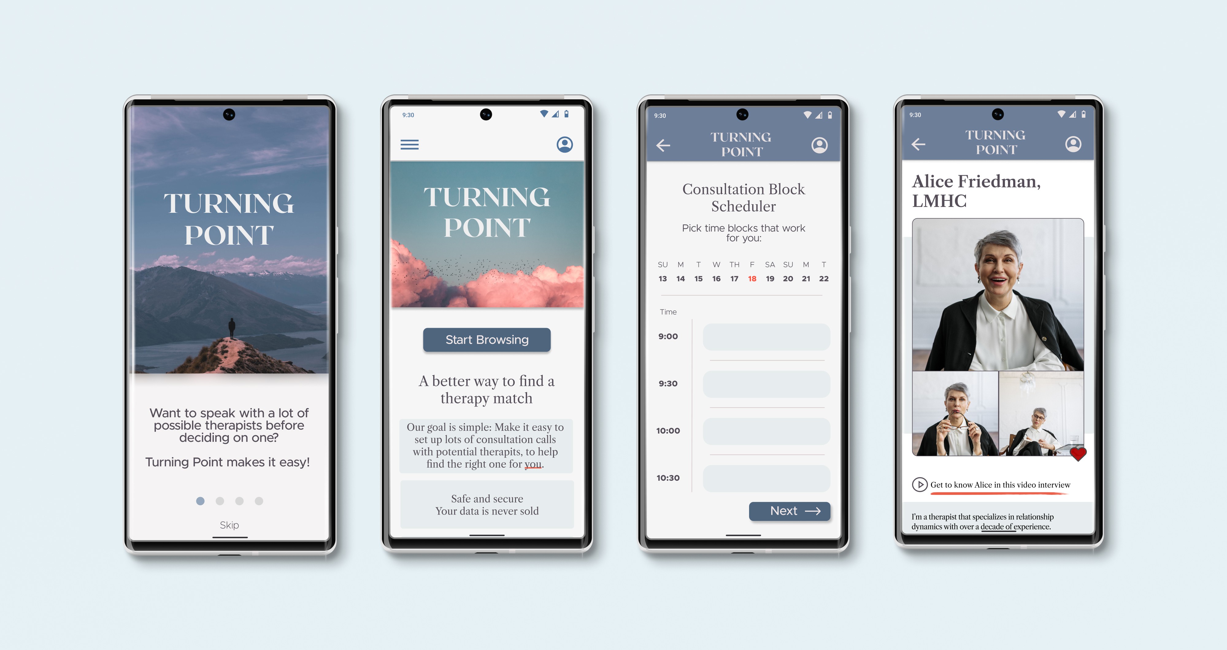
Preview of Final Product
Let’s rewind and see all the steps I took to arrive at this result.
Research
Competitive Analysis: Revealed an unmet need for help around consultation calls
Key Insights:
The most common matching methods were algorithms or a matching service based on a brief questionnaire.
Competitors left it up to the individual to set up consultation calls one by one.
None attempted to simplify this crucial step.
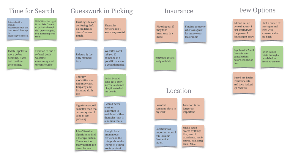
Interviews & Affinity Mapping: Confirmed that people often gave up their therapist search without feeling that they talked to enough options
Key insights:
Most people only spoke to one or two potential therapists
People didn’t have the time or mental energy to organize their search
Dissatisfaction with generic therapist profile pages
A distrust of an algorithm’s ability to find a therapist
Conceptualizing
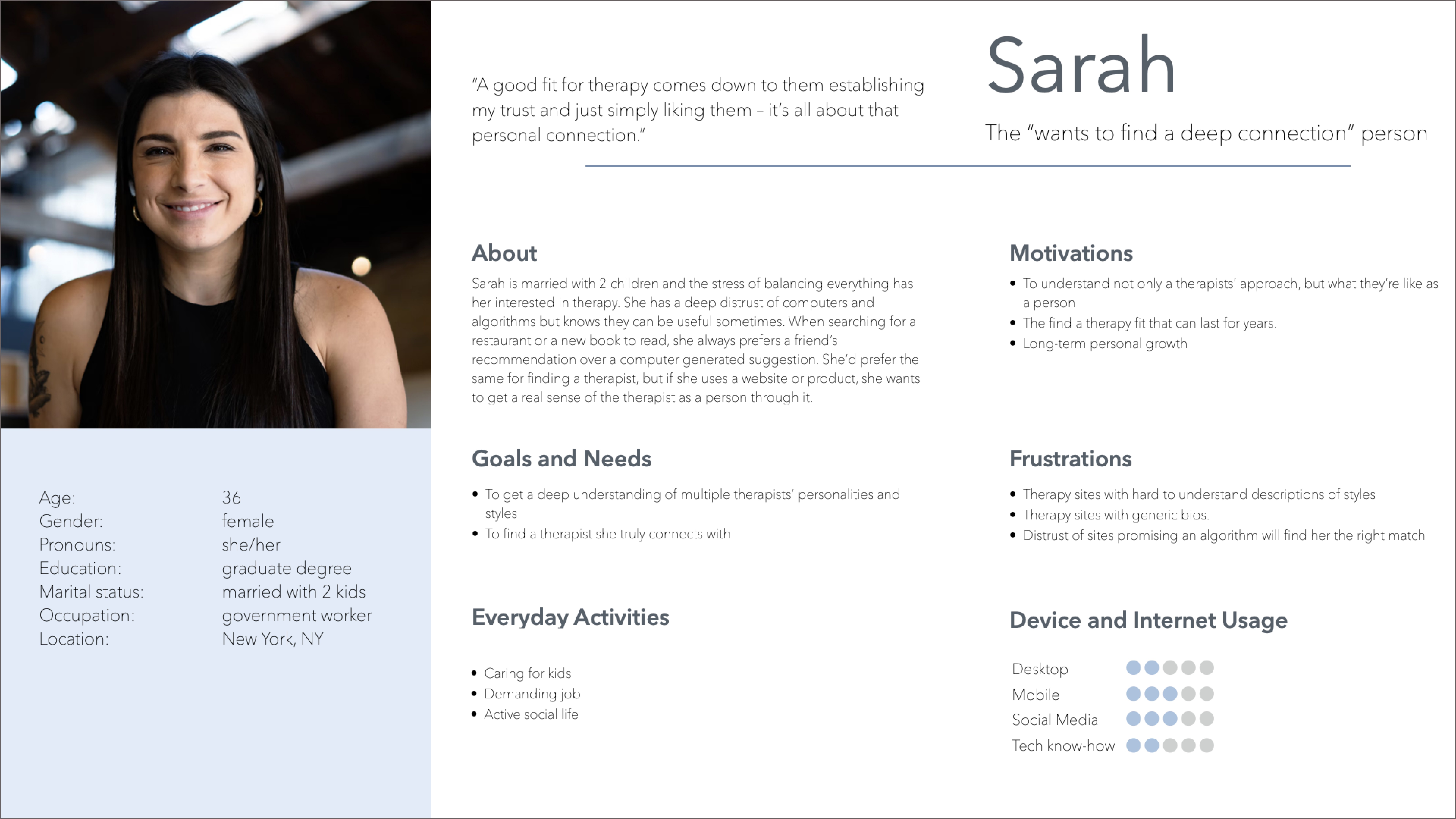
Personas: Helped connect the research with the context and goals of our users
Key takeaways:
Lack of time for a therapist search
Generic bios don’t give real insight into therapists
Algorithms don’t help match on something so personal as therapy
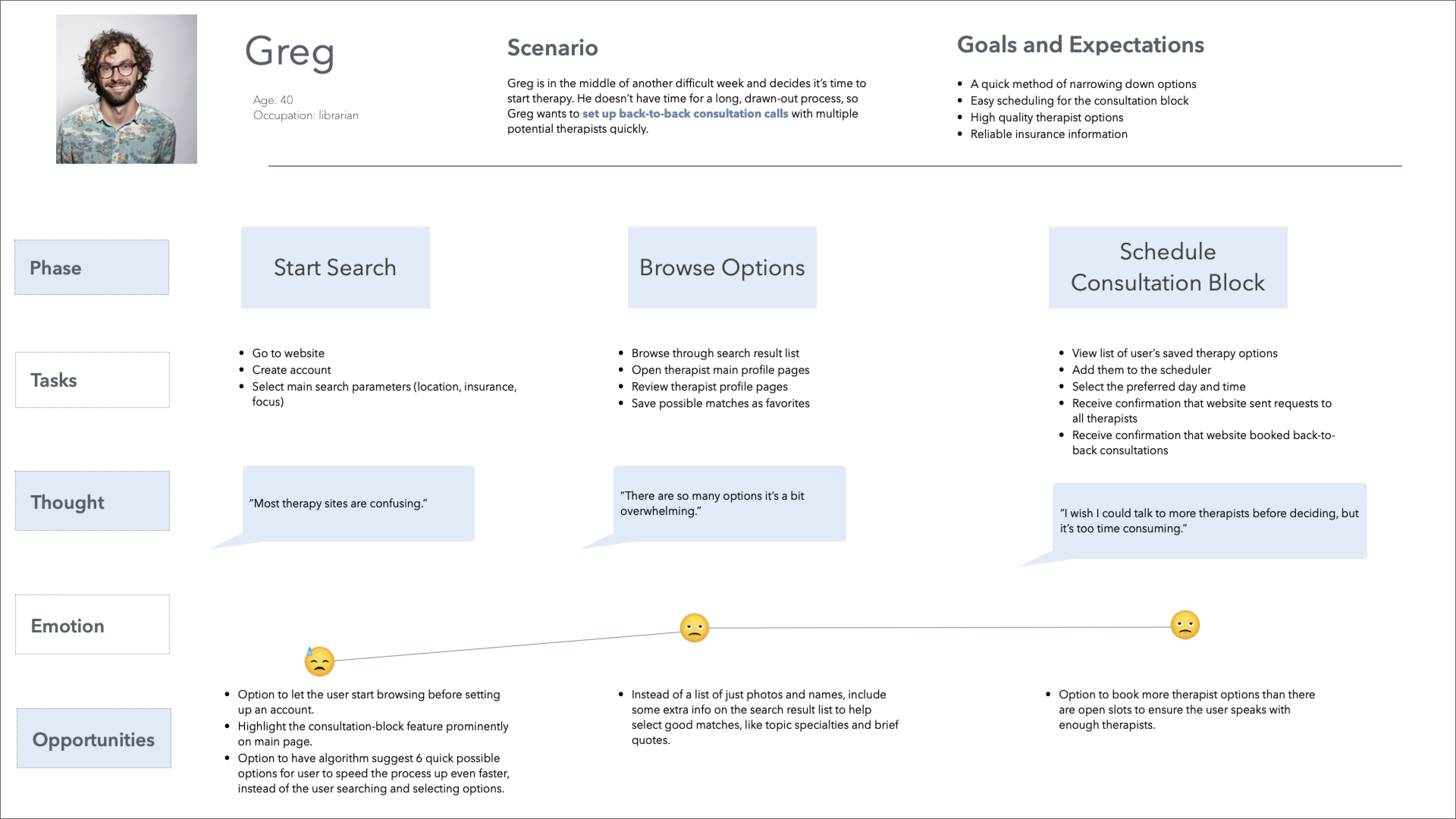
User Journeys: Showed what features might alleviate the biggest pain points
Key takeaways:
Allow users to start browsing before setting up an account
Highlight the consultation booking feature prominently
Include short video interviews of therapists on their page
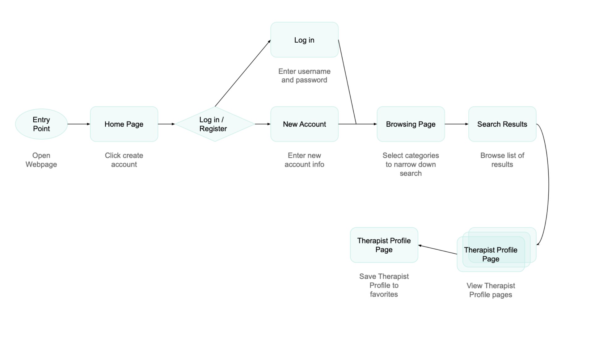
User Flows: Ensured that solutions were achievable in simple steps
Iteration:
This flow had the user create an account at the start.
User testing would lead to reevaluating this direction.
"As a busy professional, I want to set up a block of back-to-back consultation calls, so that I can narrow my choice down to the best option in the shortest amount of time possible."
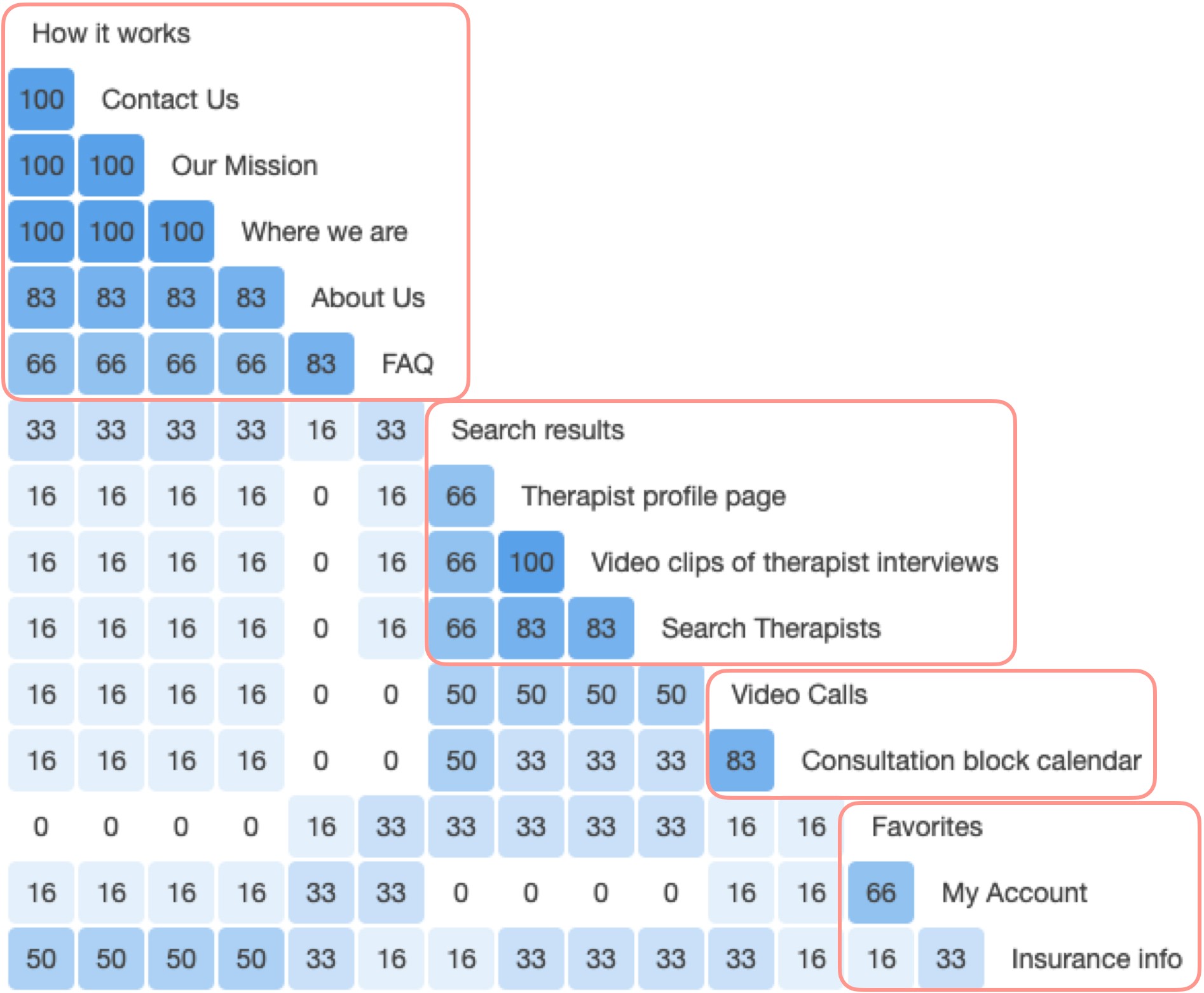
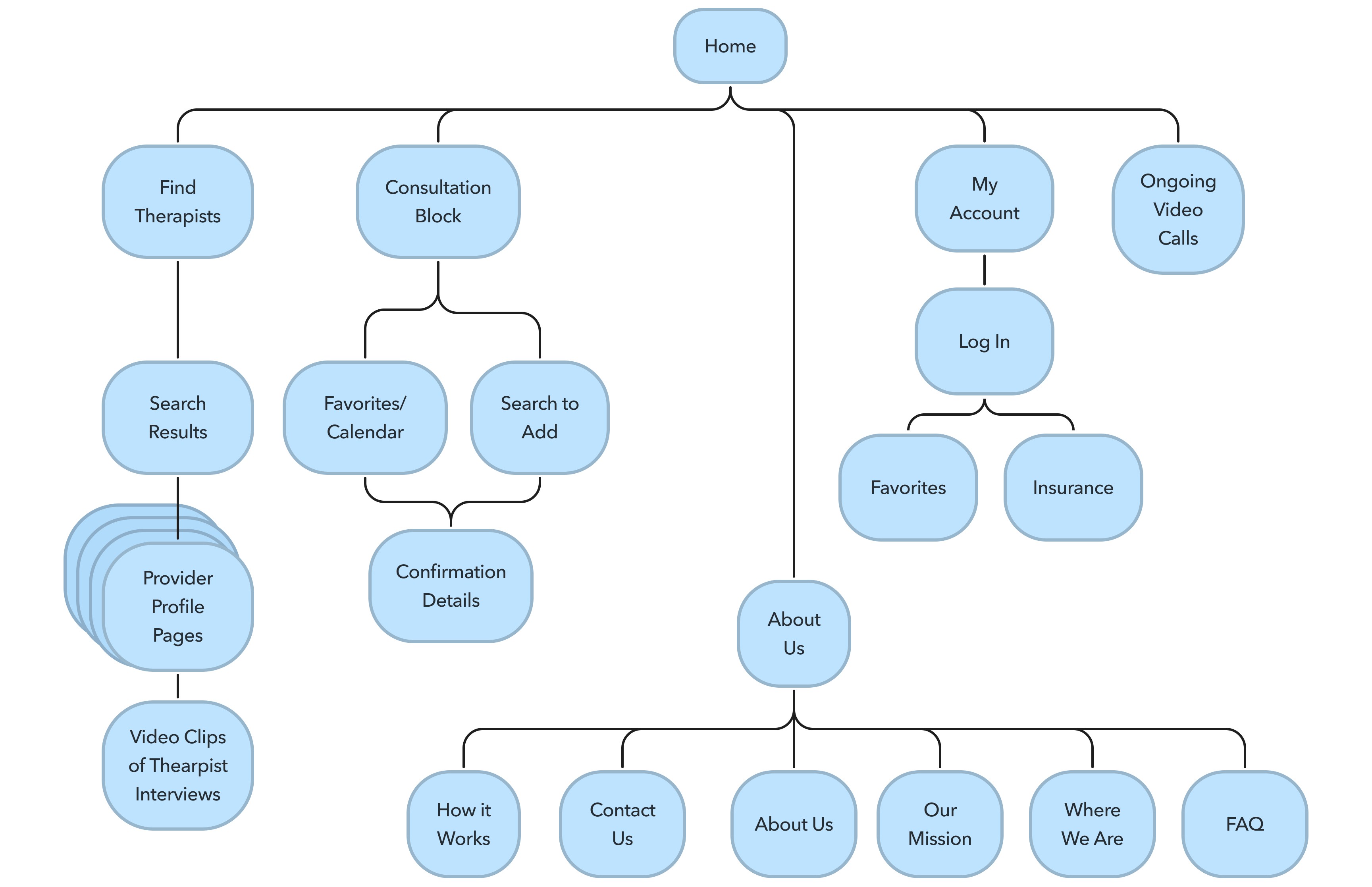
Card Sort and Site Map: Were necessary to ensure users could navigate the app
Designing
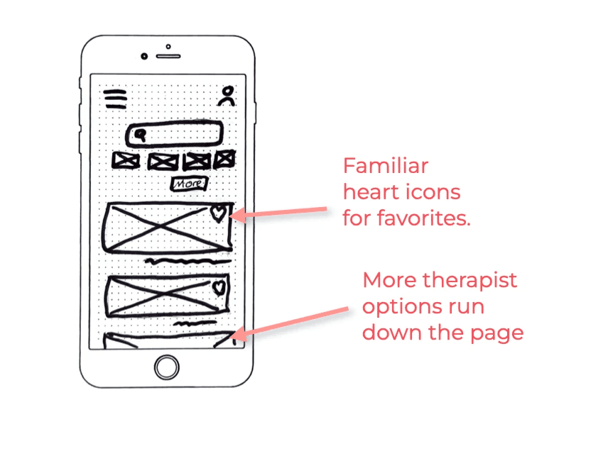
Pen and Paper Sketches: Got some ideas down (but plenty of changes were still to come)
Early thoughts:
Users looking for a therapist are often in a vulnerable state. A comforting, familiar layout that features large, friendly photos of therapists eager to help could be the ideal fit.
A big question: Navigation
I kept coming back to the idea that the navigation should hide away, so that users can focus on the therapist pages, and only appear when needed.
I decided to try a slide-out menu drawer.

Mid-fidelity Wireframes: Featured coach marks for onboarding but that would change after some testing
Iteration:
Usability testing would lead me to change the onboarding coach marks to a swipe through tutorial

Feedback and Testing
Usability Testing, Affinity Mapping, & Rainbow Spreadsheet: Highlighted privacy concerns and the need for onboarding clarity
Six participants.
They either have gone to therapy or were open to going one day.


Key takeaways:
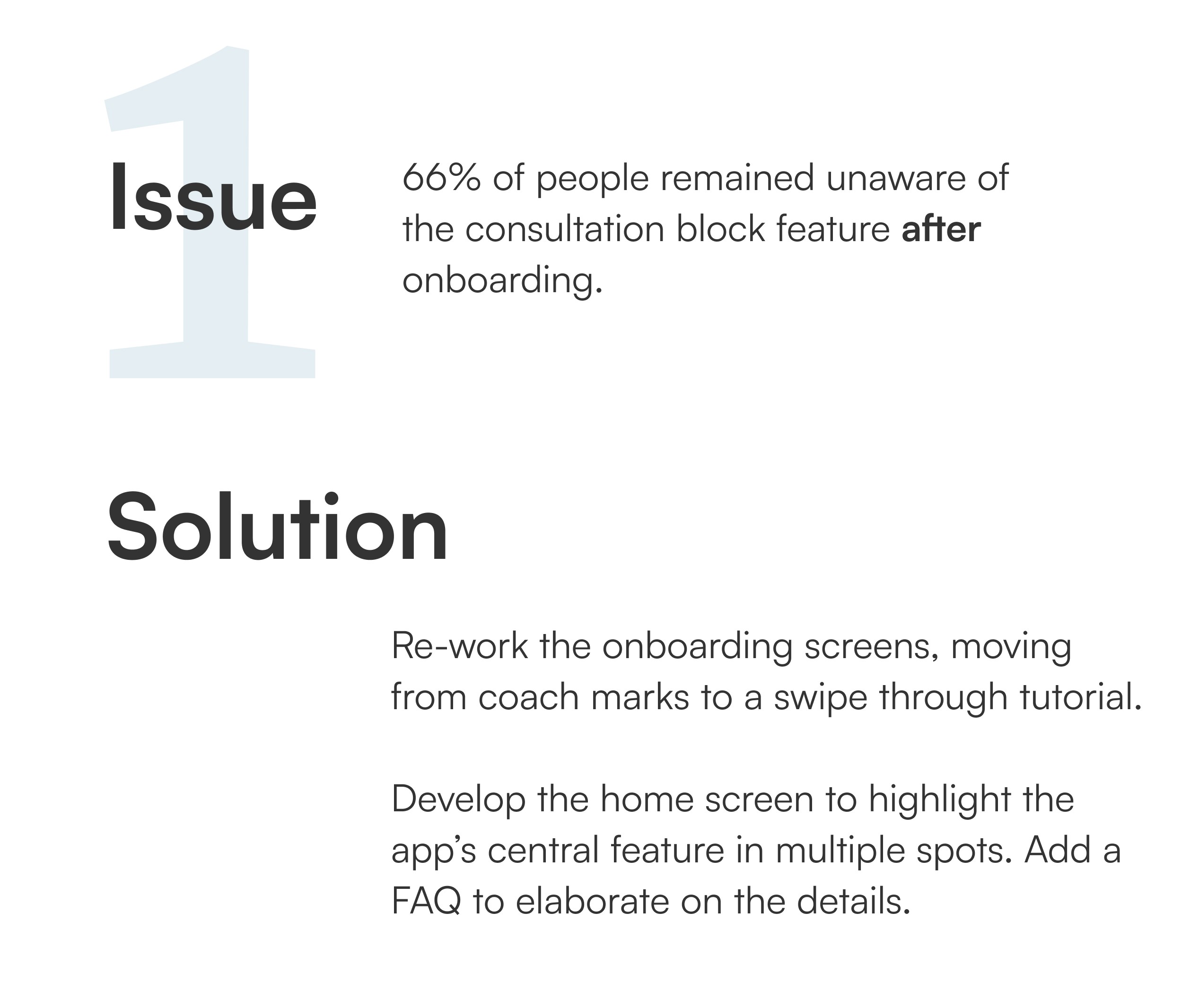
Onboarding didn’t get the key value proposition across
Privacy concerns were high with a therapy service
The Net Promoter Score was calculated at -40%, which shows plenty of room for improvement in future iterations.
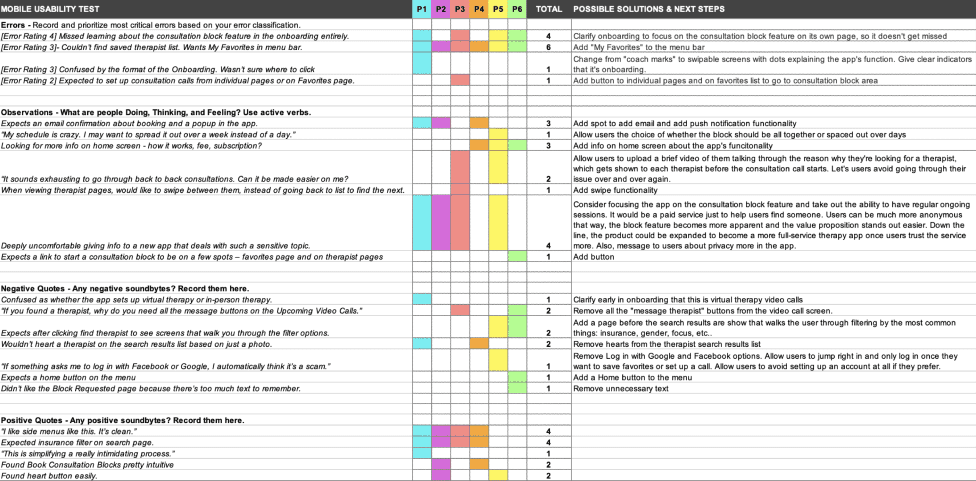
Some quick and small changes:
Removed the heart icon from the search results list. People said they would need to view the full profile page before adding them to their favorites.
Add “My Favorites” to the menu bar
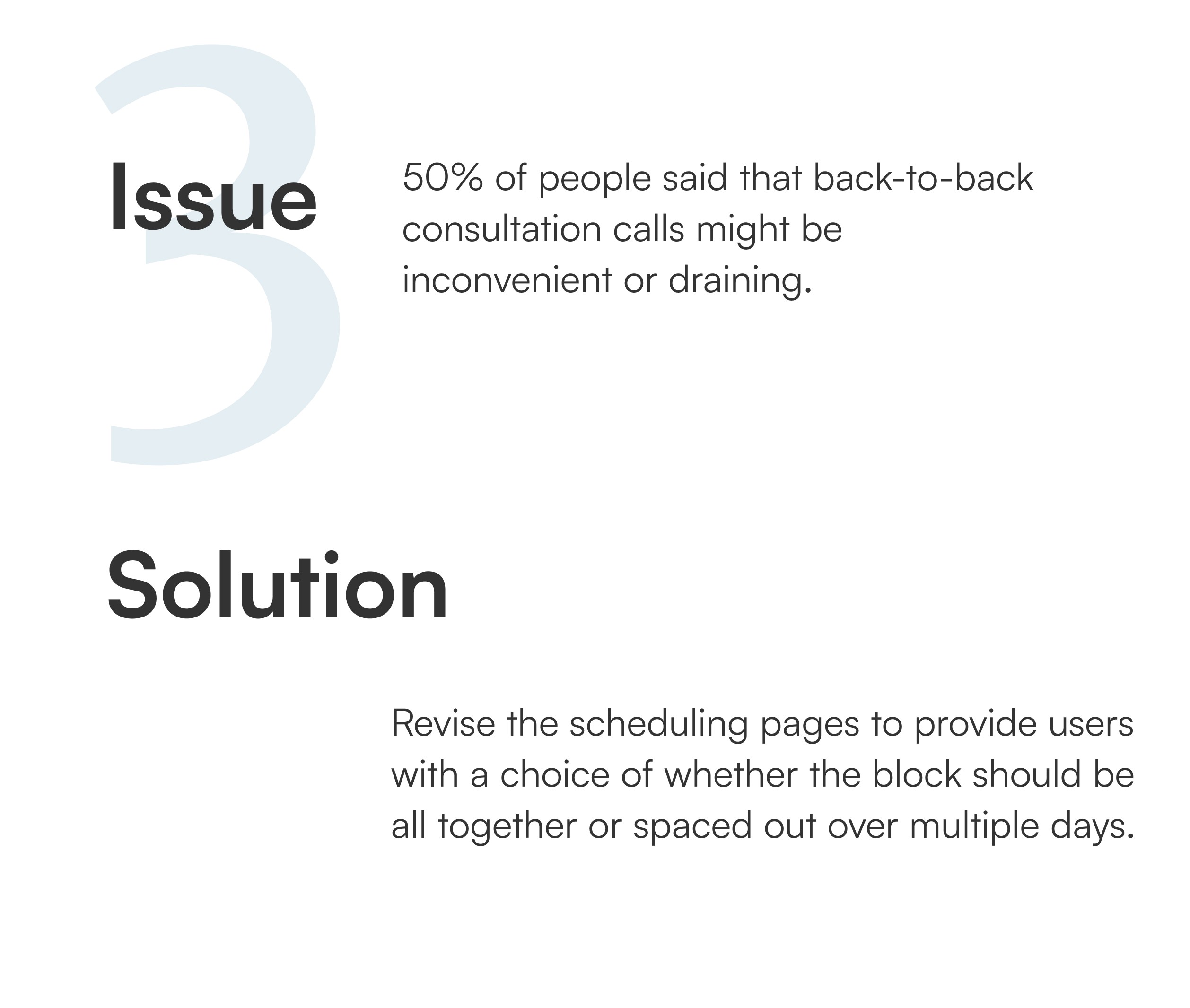
Here are three main examples of bigger changes:
Preference Testing Voice
The voice for a therapy app must be well thought out. It must be professional but not cold, detailed and informative but not so technical that it alienates users.
It needs to discuss some deeply serious topics but without diminishing the therapy seeker’s hope. To help get the tone right, I used a preference test to compare two approaches.
Framed around the problem we're trying to solve.
Framed around the solution we're offering.
83% of participants chose option B, the screen that focused on the solution being offered.
I used that data to establish the tone for the rest of the application.
Metrics
Updated Usability Test: Showed dramatic improvements
The Final Product
Reflections
Examine my assumptions: I learned that I shouldn’t assume people coming to my app or website are already familiar with its central function. People may find themselves opening it for a variety of reasons and it's up to the design of the product to teach itself to the user. It must give the user not just the "how" to use it, but also "what" it is.
Balance niche and broad appeal: Some people like a product that feels designed just for them. At the same time, great design can strive for broad appeal across a wide range of users. A therapy application like this has grapple with this balancing act. It must make an individual user feel like the application can aid them with their deeply personal problem, and at the same time it must feel welcoming to anyone seeking the help they need.

