PS 889
A redesigned website for a NYC public elementary school.
Timeline
3 months
My Role
Tasks
UX design, UX research, UI design, collaboration with freelance software engineer
The Department of Education only allows schools to use sites like Wix and Weebly, and has rules about font, design and logos.
No-code builders had limitations around more advanced features, UI customizations, spacing, and responsiveness.
Photos and videos that the school provided were low-fidelity.
The school’s budget for a new website was limited so some features were not possible.
I worked with the school’s principal and the president of the Parents Association.
The PA president provided lots of feedback and was quick to reply to my questions over email.
The school principal’s schedule only allowed for limited time, so we arranged meetings and I came prepared with questions and deliverables to share.
I also met with the teacher who would run the site and had frequent meetings with the developer who would code custom solutions.
Because of the DOE limitations regarding website builders, the focus was on a new site’s information architecture, and using design and content to bring out the school’s character and story.
See the final site: www.ps889.org
237.5%
Improved SUS score
36.39%
Increase in monthly visitors
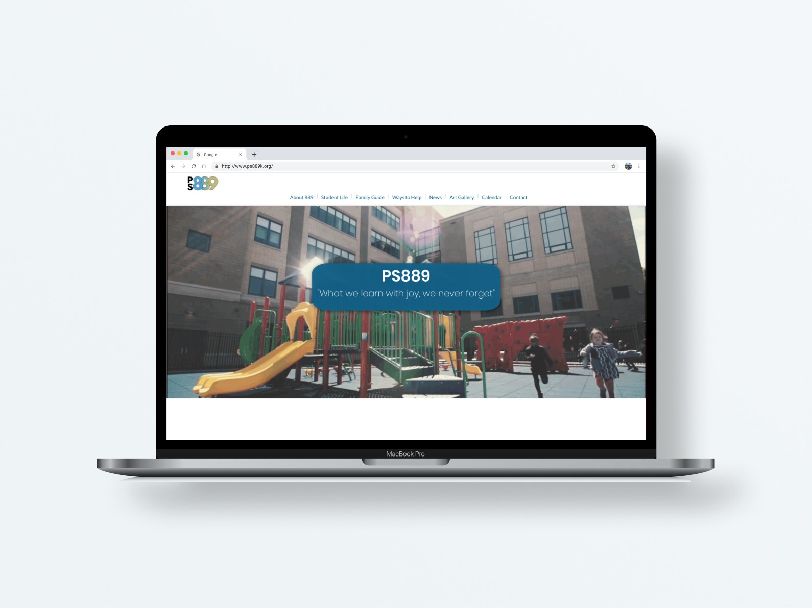
Confusing information architecture
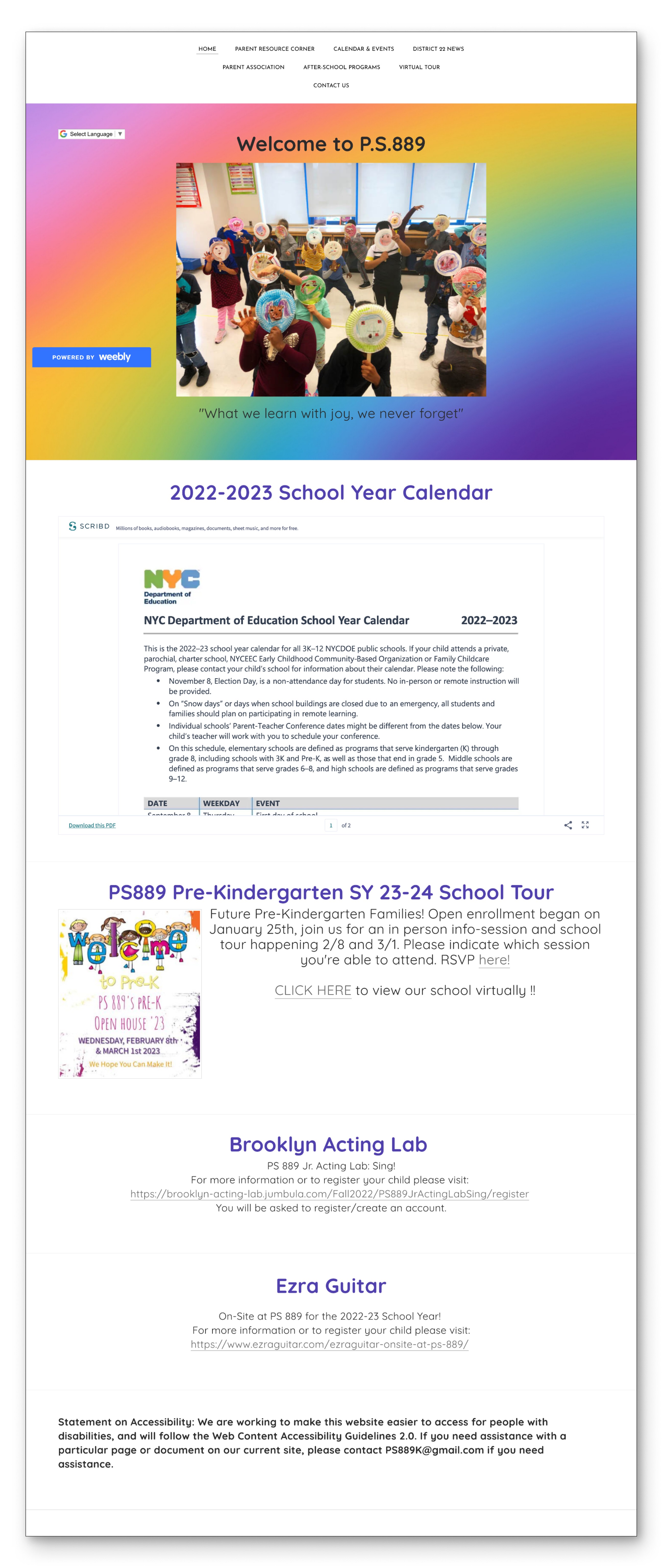
Calendar is only accessible through a link to an external PDF
School closing info is in an embedded PDF that is cropped into small view box
Lack of photos of kids in school doesn’t get across the character and voice of the school
Outdated information
To show action and kids having fun at school
Homework
(Research Phase)
Competitor Analysis: Revealed some common features on other school sites
What I looked for:
What info was being prioritized?
How intuitive was the information architecture?
How does the site express the school’s character?
Key Takeaways
Calendar on home page that shows the next few events
At-a-glance info about the school
Images of kids in action
Core values on the home page
Interviews & Affinity Mapping: Revealed current pain points and lack of the school’s character on the current site
Interviewed the principal, teachers, current parents and prospective parents
Key Takeaways
Show the character of school
Show more insight into the experience of kids, especially extra-curricular and clubs
Pain point – staying updated with the school calendar
Show a data snapshot
Show more ways to get involved
Pain point – navigation was confusing
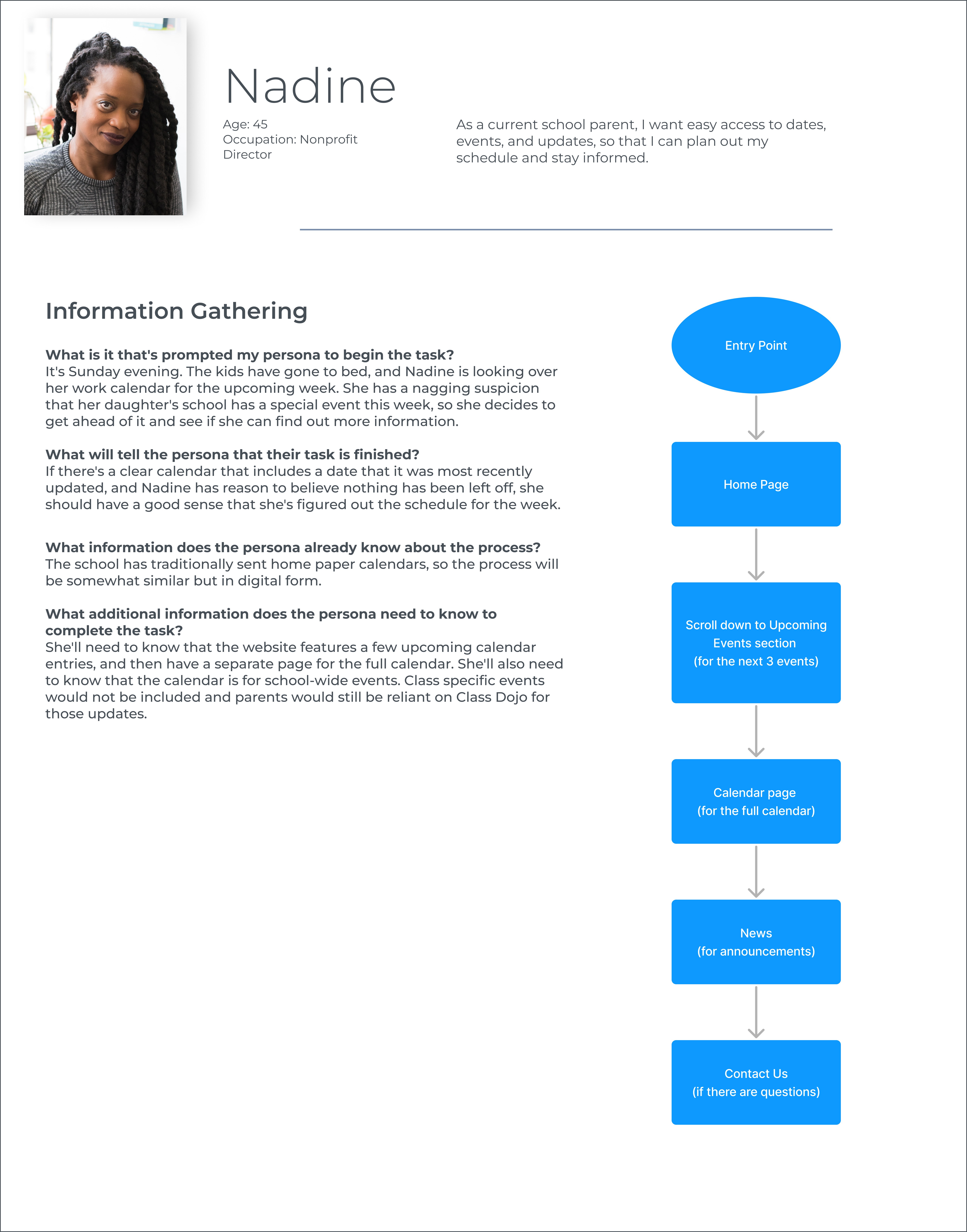
Personas: Created for current and prospective parents
Key Takeaways
Prospective parent – Show a data snapshot and the character of the school. The school’s site should instill confidence.
Current parent – Busy parents need easy to find, organized, and up-to-date info so they can make the most of their available time. They also want to see updates from the various clubs and arts programing.
User Stories: Took insights from the personas and broke them into actionable steps
As a prospective school parent, I want to see information about arts and other extracurricular activities, so that I can understand the character and nature of the school before applying.
As a prospective school parent, I want to see a data snapshot, so that I can understand the key information about the school before applying.
As a current school parent, I want to see a simple and up to date calendar, so that I can keep informed about upcoming events.
As a current school parent, I want to easy access to ways to get involved, so that I can support the school in ways that work for me.
User Journey Map: Helped us focus the biggest pain points, like the calendar
Key Takeaways
Calendar setup on current website is the biggest pain point
Art Class
(Designing)
User Flows: Helped map out how the User Stories would be addressed
Card Sort: Helped address one of the biggest pain points – the information architecture
Key Takeaways
Moved Curriculum into About 889 section
Moved Early Drop-off into Family Guide
Separated out Ways to Help as its own category

Site Map: Was revised based on the card sort data
Original
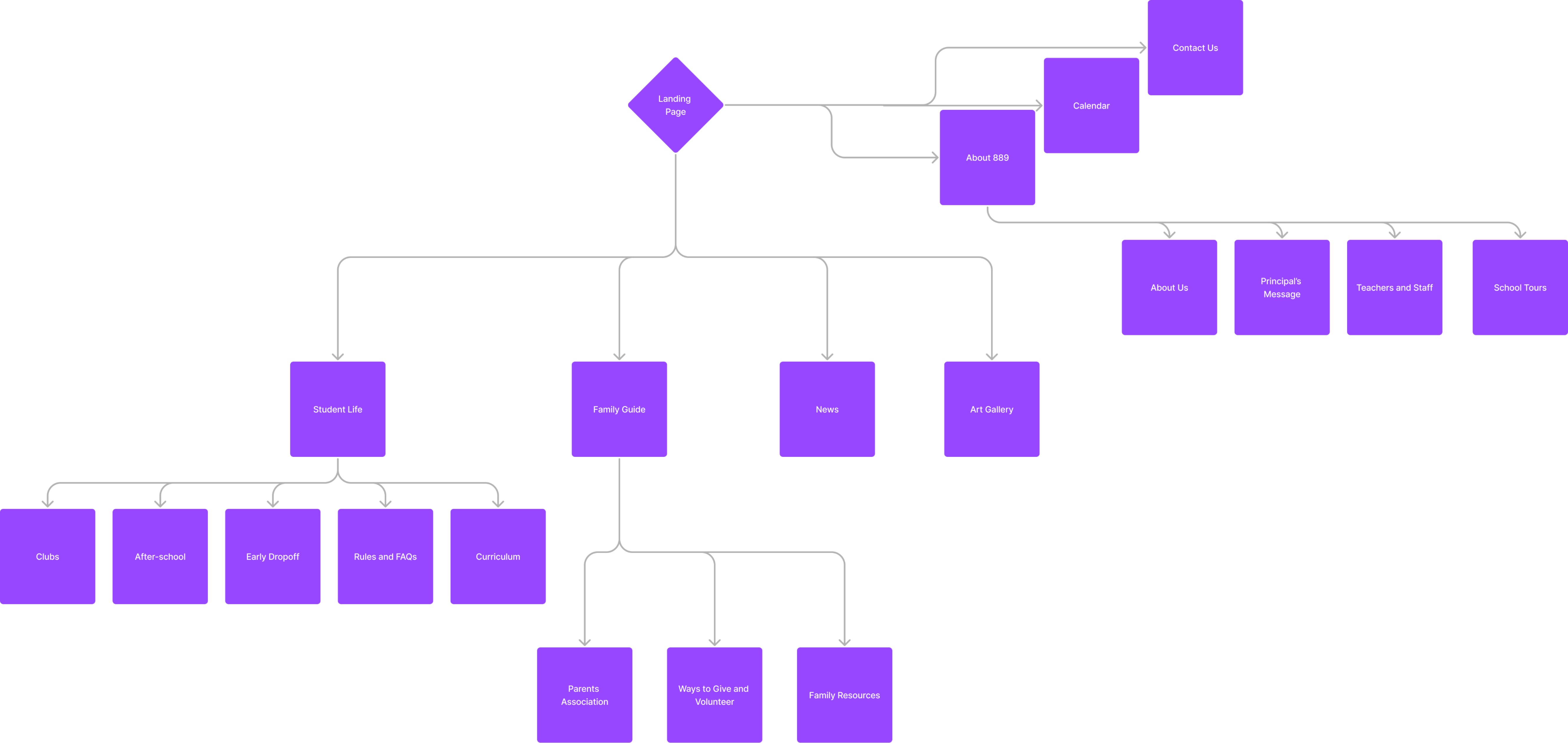
Revised (after card sort)

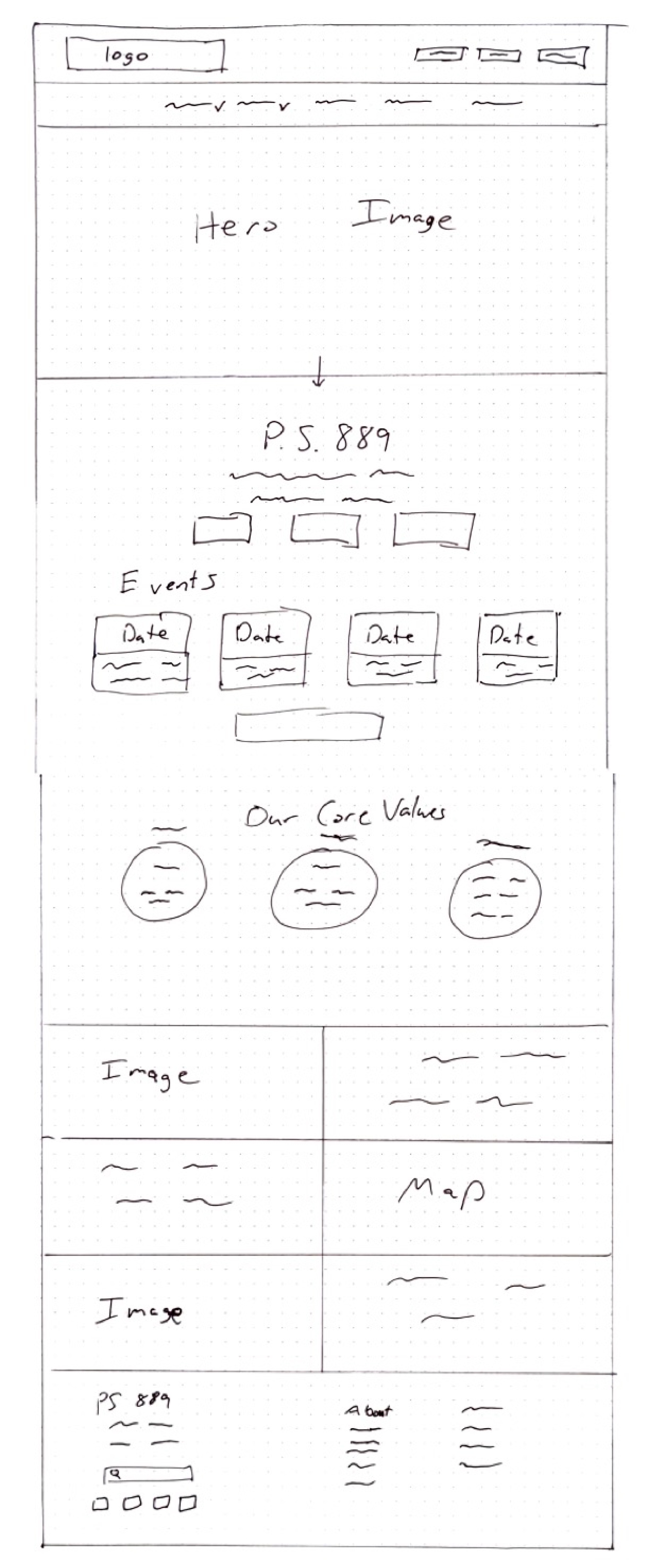
Wireframes: Started as pen and paper and evolved based on feedback and the project’s limitations
Changes made because of User Interviews and the limitations of Wix:
Two level navigation was consolidated into one level for simplicity
Playful rounded triangular shaped images were intended to evoke building blocks and a youthful tone, but for simplicity, standard photo shapes were eventually used. The focus then was on selecting images that conveyed the same tone.
At-a-glance data snapshot was included on the home page
Finals
(The End Product)
Home page:
The character of the school
A quick view of news and upcoming events
Intuitive navigation
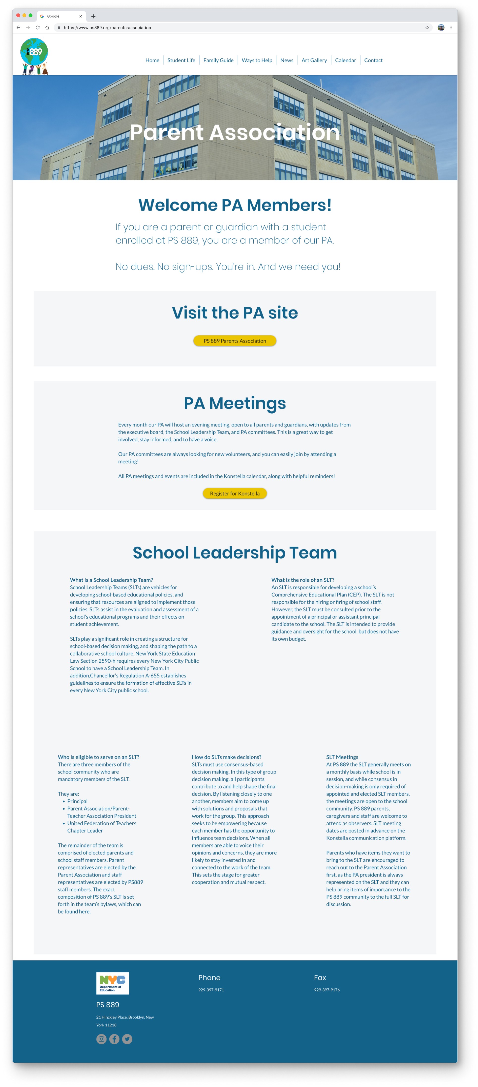
Parents Association
Revised to fit on just one page
Separate sections are batched for clarity
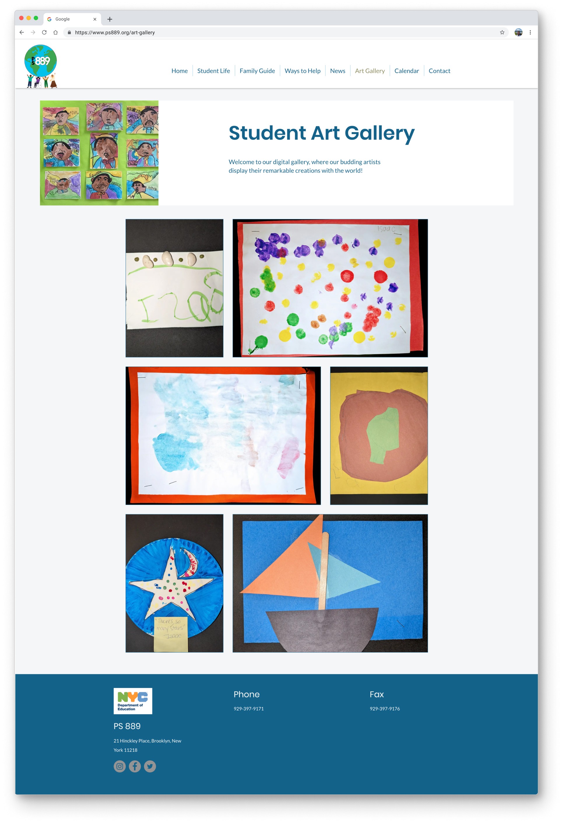
Art Gallery
A dedicated page helps parents connect with their kids’ experience at school.
Calendar
Organized updates for parents
Report Card
(Metrics)
Before site usage could be measured, I ran a System Usability Scale (SUS) survey on the original site and again on the new site. I chose the SUS because I could compare it to baselines set from years of SUS surveys.
A school’s website needs to empower parents and help students, but it also needs to instill confidence in the families with kids in the school. A higher SUS score suggests the site succeeds in that goal.
We gave the SUS survey to 5 parents for the old site and 5 for the new site.
The original website had an average SUS score of 24.
The new site had an average SUS score of 81.
That’s a 237.5% improvement!
A 36.39% improvement in monthly visitors compared to the same time last year was recorded.
Show, don’t tell
This is an often repeated bit of advice when editing books. Showing something in a scene can get across the emotional experience better than telling the reader the same information. Here, I used the same approach when trying to get across the character of the school. Instead of writing it out, I used expressive photos to show kids enjoying their time at school, using their creativity, and playing. A dedicated Art Gallery section also showed the ways the school helps kids express themselves.
Focus on backend use
One of the core needs of end-users is up-to-date news and calendars. It needs to be as easy as possible for the school to keep their site updated.

